
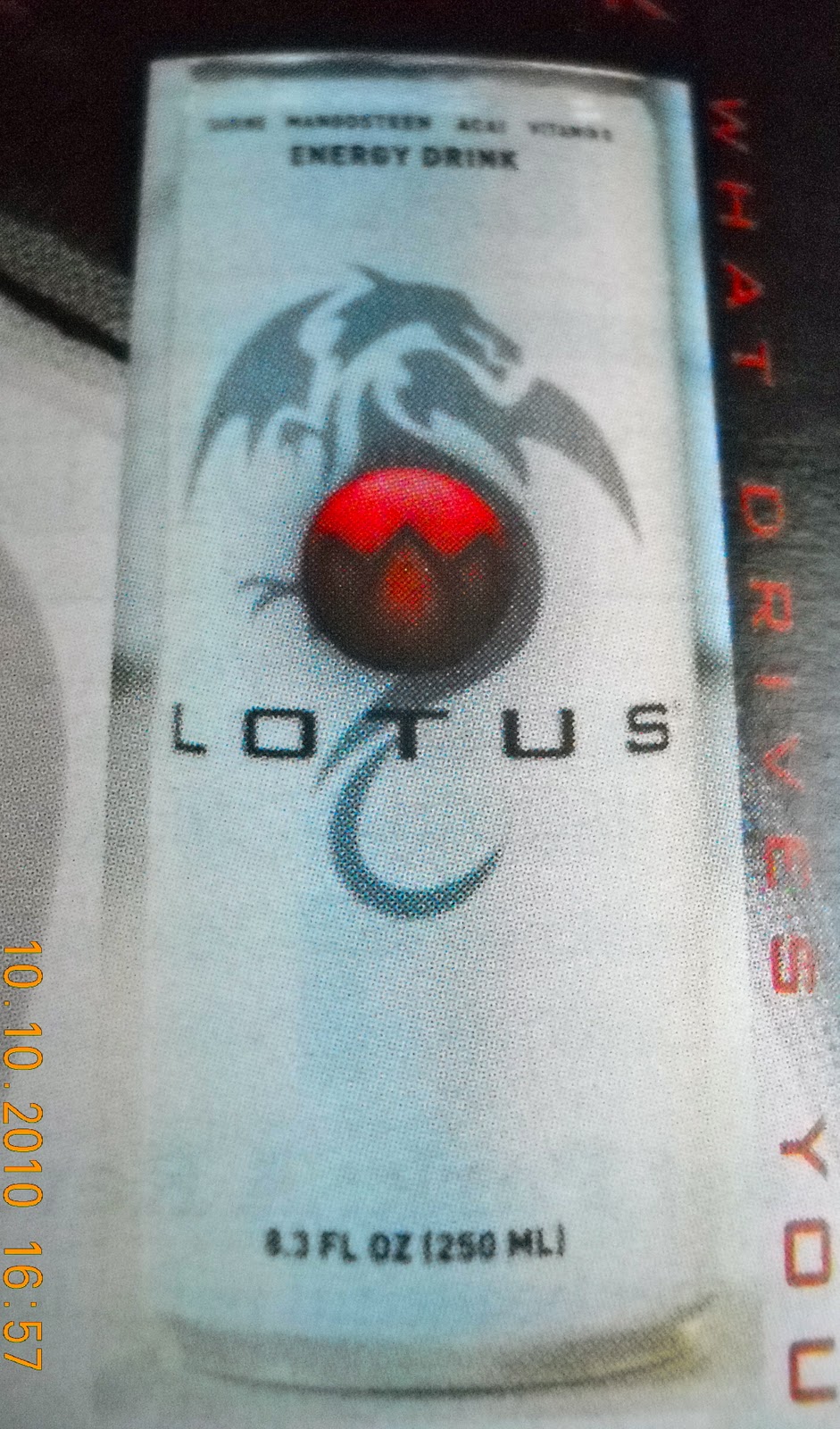
I loved this when I saw it! The design is pretty incredible. This is an ad for Lotus Energy Drink...The can pretty much sells itself really! I love the use of graphics in this ad, from the dragon on her face-showing shadow, to the Lotus symbols in her eyes! It's pretty great! My eyes go to the girl first and then move to the actual can of the product. The red lettering is good against the white, but fades away into the black, which makes it really hard to read. You can tell that the text wasn't important in this ad, because if it was it would stand out more! I think the designer was more focused on the product standing out.

No comments:
Post a Comment